YAU

Moving like a local
People want their beer to be real. So if your brand says you’re all about local drinking culture, you better mean it. Particularly when your audience are super-sharp Hong Kongers able to spot a fake a mile away.
When Yau first launched, it was set for greatness. It had the global knowhow of Carlsberg and the pioneering spirit of Brooklyn Brewery. And it needed a brand with realness and authenticity. One that told Hong Kongers: “we’re one of you.” A brand rooted in the thing it was always meant to be about: “yau”, or “friendliness”.
Sector
Food & Beverages
Expertise
Brand Strategy
Brand Identity
Packaging Design

But something was missing. That realness. That authenticity. Those little cues that told Hong Kongers: “we’re one of you”.
Jon Neal
Creative Director, Asia
Take the name: HK Yau. Nothing says “foreign import” to drinkers in Hong Kong than the letters HK.
So it disappeared. Instead of a brand dressed in cliches, Yau became rooted in the thing it was always meant to be about: “yau”, or “friendliness”.
The kind of friend who gets it. The friend who knows all the in-jokes. The one who doesn’t try too hard, and doesn’t expect you to, either.


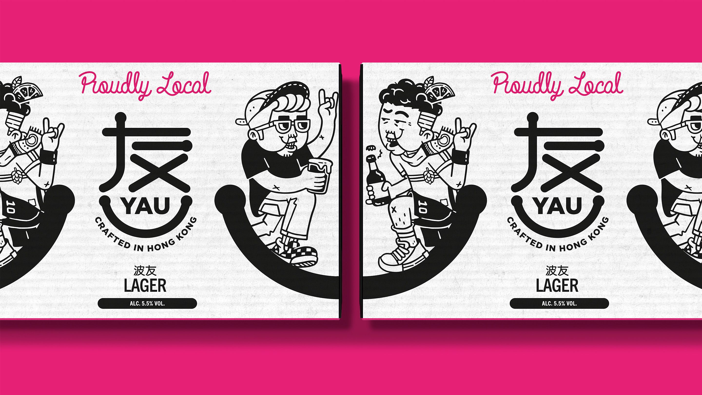
After Yau, came yauisms. Hyper-local, uber-relatable Cantonese puns that gave life to a whole range of beers.
Tim Siro
Executive Creative Director, Asia
Fancy a lager? Meet Bor Yau, the yau that’s always up for a ball game. Want a wheat beer? Say hey to Chu Pang Gau Yau, the soul of the party. Or how about a pale ale with Fat Siu Yau, the always-on enthusiast?
And from yauisms, a visual identity emerged—as vibrant and head-turning as the city itself. Eye-popping colours, brain-melting illustrations. The inimitable friendliness of Hong Kong, canned and ready to go.
