SINOCHEM

In Science We Trust
Creating beauty with chemistry
Client
Sinochem
Sector
Industrial & Utilities
Expertise
Brand Identity
Communications
The logo is inspired by a peony – recognised by many as the national flower of China. A symbol of harmony and prosperity, the blooming flower is rendered with geometric patterns, creating a 3D logo that’s rooted in nature, enhanced by technology. The four petals represent the four elements of society, consumer, shareholders and employees, for whom Sinochem creates value in its work to harness the power of chemistry for social progress.
We developed a brand strategy and visual identity to showcase this harmonious relationship between chemistry and nature, and Sinochem’s mission of growth through innovation, promoting the sustainable development and its contribution to a brighter future.
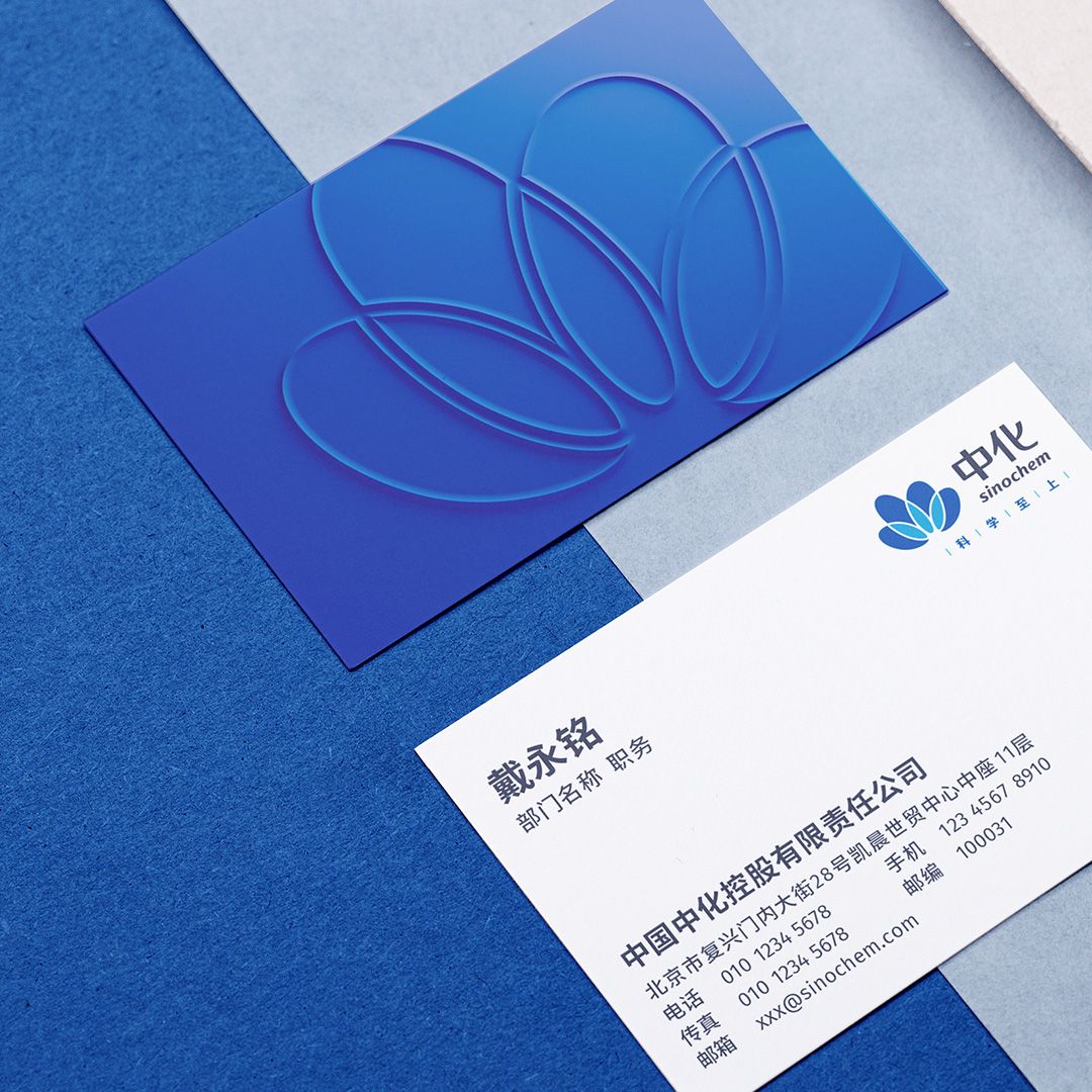


We created 3D expressions and extracted stereoscopic lines from the 3D brand logo to carve out silhouettes and contours of images found in nature, that highlight the world of advancements that Sinochem has achieved through innovation and the vitality it brings to the world.
The brand colours of blue – a nod to scientific innovation, and yellow, green and light blue tie the identity to nature, and Sinochem’s role in creating beauty with chemistry. Leveraging the 3D line expressions and the dynamism of light and shadow, the new brand identity system showcases the innovation brought by scientific exploration, its harmony with nature, for the betterment of society.